
Why style choice matters
A prompt describes what should appear in the image, but the selected style influences how that idea is visually interpreted. A realistic style tends to emphasize physical materials, camera blur, lighting behavior, and real-world texture. An illustration style tends to simplify shapes, clean up colors, and make the subject feel more designed.
This does not mean one style is better than the other. The right choice depends on the purpose of the image. A realistic image may be better for product-like visuals or believable scenes. An illustration may be better for storytelling, concept art, icons, or friendly character-focused images.
Example: the same robot gardener idea
For this example, both images use the same core idea: a small cute robot gardener holding a watering can in a greenhouse. The goal is to compare style direction, not to completely change the subject.
Prompt used
The prompt is intentionally simple. It gives the model a clear subject, action, location, lighting direction, and level of detail.
a small cute robot gardener holding a watering can, standing in a greenhouse, plants in the background, soft morning light, detailed scene
Comparison setup
To make the comparison useful, most settings should stay the same. The main difference is the selected style.
| Prompt | Same core prompt |
|---|---|
| Image shape | Landscape |
| Seed | Same seed for both examples |
| Style A | Photo |
| Style B | Illustration |
| Main subject | A small robot gardener in a greenhouse |
Using the same seed can make the comparison more controlled. It does not freeze every object, but it helps make style differences easier to notice because the base idea remains similar.
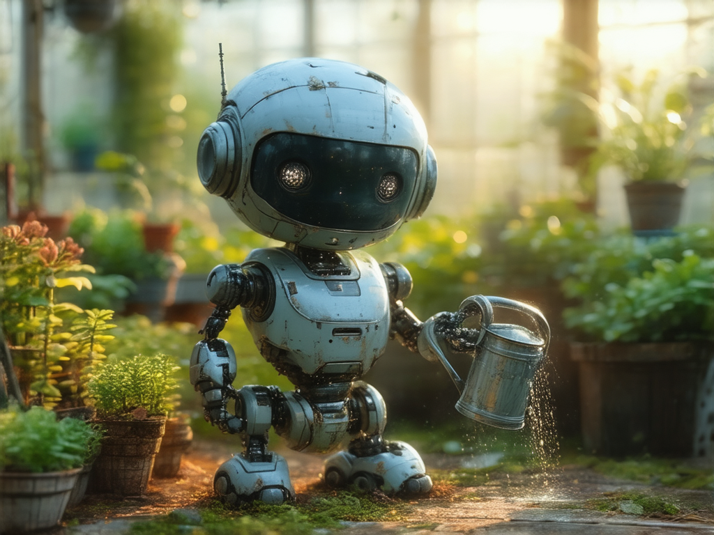
What the Photo style emphasizes
The Photo-style result leans toward a physical, camera-like interpretation. The robot feels more like a small object that could exist in a greenhouse. Surface scratches, darker joints, reflective metal, water droplets, and background blur all help create a more realistic impression.
This style is useful when you want an image to feel more grounded. It works well for scenes where material texture matters: metal, glass, fabric, wood, skin, food, objects, products, rooms, streets, and natural light.
Choose Photo when you want:
realistic lighting, physical texture, camera feel, lens blur, material detail, believable surfaces
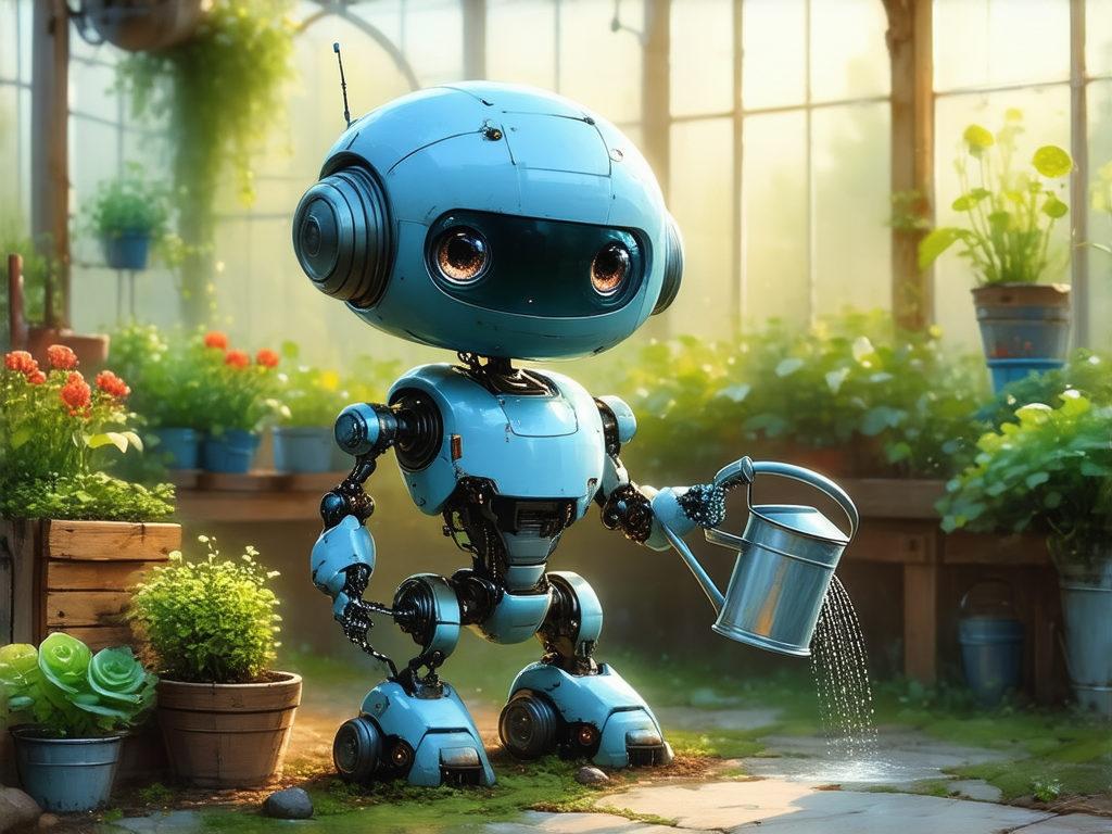
What the Illustration style emphasizes
The Illustration-style result is still detailed, but it feels more designed. The robot shape is cleaner, the colors are more organized, and the scene has a more character-focused look. The subject feels less like a photographed object and more like a polished concept or storybook character.
This style is useful when you want a friendly, readable, or stylized image. It works well for characters, mascots, visual concepts, educational graphics, fantasy scenes, posters, and images where clarity is more important than strict realism.
Choose Illustration when you want:
clean shapes, softer stylization, brighter colors, concept-art feeling, character design, less photographic realism
Side-by-side differences
The difference is not only about whether the image is “real” or “drawn.” Style affects many smaller visual decisions at once.
Photo style tends to show scratches, dirt, reflective surfaces, water particles, and small imperfections. Illustration style tends to smooth or simplify those details.
Photo style often feels more natural and lens-based. Illustration style often uses cleaner, brighter, and more intentionally arranged colors.
Photo style can keep irregular physical details. Illustration style often makes the subject easier to read by simplifying the form.
Photo style may use stronger depth of field and blur. Illustration style may keep the scene more evenly designed and composed.
When to choose a realistic style
Choose a realistic or Photo-style direction when you want the image to feel like it was captured by a camera. This is especially helpful for subjects where physical detail matters.
Cups, tools, furniture, bags, devices, vehicles, and other objects benefit from believable material detail.
Cafes, streets, rooms, gardens, workspaces, and travel scenes often work well with a camera-like style.
If your prompt mentions metal, glass, fabric, wood, stone, steam, rain, or reflections, Photo can make those details feel physical.
Natural light, lens blur, shadows, rim light, and depth of field usually feel more grounded in a realistic style.
When to choose an illustration style
Choose Illustration when you want a more designed image. This can make the result easier to understand, more expressive, or more suitable for creative presentation.
Cute robots, animals, fantasy creatures, and friendly characters often become more readable in Illustration style.
Illustration is useful for exploring ideas before they need to look realistic or production-ready.
Cleaner shapes and simplified detail can make an image easier to understand at a glance.
Illustration works well when mood, charm, or visual identity matters more than photographic accuracy.
Prompt tips for comparing styles
When comparing realistic and illustration styles, avoid changing too many things at once. Keep the subject and scene the same, then only change the selected style. This makes it easier to see what the style preset is doing.
- Write one clear prompt with a simple subject and setting.
- Generate once with Photo or a realistic style.
- Use the same prompt and seed with Illustration.
- Compare texture, color, shape, lighting, and background detail.
- Choose the style that better matches your intended use.
Variation ideas to try
The robot gardener example can be adjusted in small ways while keeping the same comparison structure.
More realistic product-like version
a small cute robot gardener holding a metal watering can, standing in a greenhouse, scratched painted metal body, plants in the background, soft morning light, realistic material detail
More illustration-friendly version
a small cute robot gardener holding a watering can, standing in a bright greenhouse, friendly character design, plants in the background, soft morning light, cheerful detailed scene
More storybook version
a small cute robot gardener watering tiny flowers in a greenhouse, warm morning light, gentle plants in the background, peaceful storybook mood, detailed scene
Final thoughts
Realistic and illustration styles are both useful, but they serve different goals. The realistic version of the robot gardener feels more like a physical object photographed in a greenhouse. The illustration version feels cleaner, brighter, and more character-driven.
When choosing a style, start with the purpose of the image. If you want believable materials and camera-like lighting, choose a realistic direction. If you want a clearer, friendlier, or more designed visual, choose Illustration.